
|
Multiple Sketches For evaluation
|


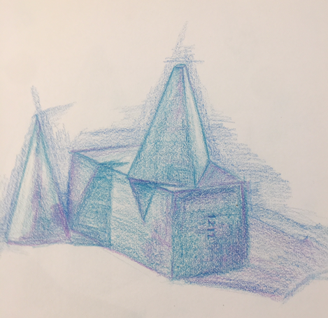
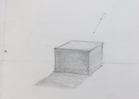
Still life of blocks with multiple light sources.
Colored Pencil
Colored Pencil
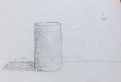
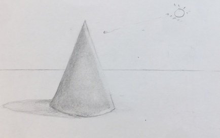
4 pencil shape drawings
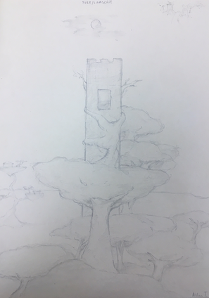
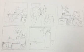
Compositional Sketches
In Progress
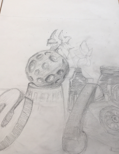
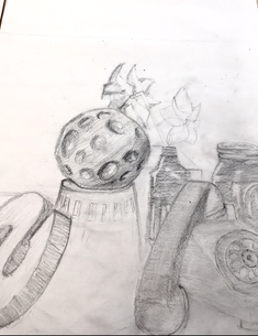
Final
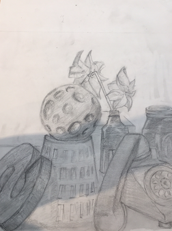
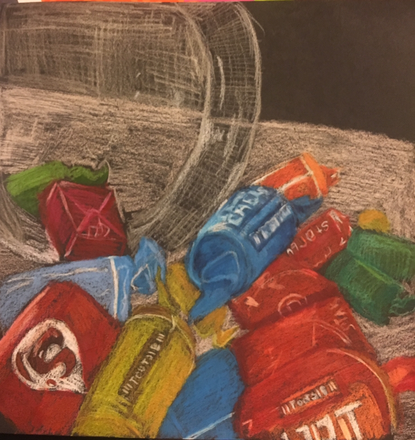
Question 1: I put together the composition to put larger more important objects in the front,
and keeping less complex objects in the background. I personally think the composition could be better.
Question 2: I used a wide range of values to make objects seem 3d and lighter values for background objects.
Question 3: Practice studies helped me understand where and when to put certain values and my knowledge contributed through making objects look more believable.
Question 4: Most of the time i used the pencil on its side to make larger lines and make drawing large things easier. It also gave me more control over the values.
Question 5: The best example of texture is the shine on the bottles but most of the objects look flat.
Question 6: I would spend more time on the shapes and perspective before rendering, and focus more on textures.
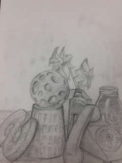
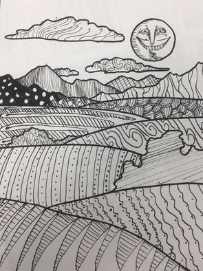
Pattern Landscape
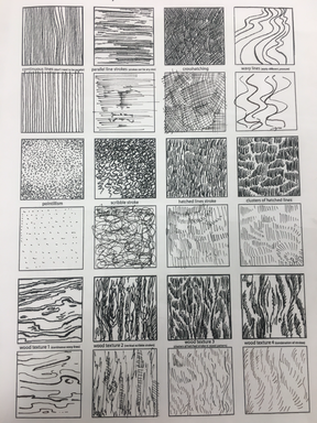
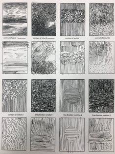
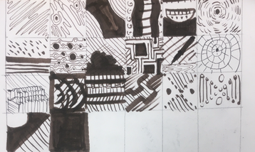
Pattern Worksheets
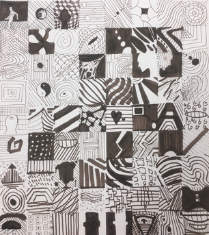
100 Patterns
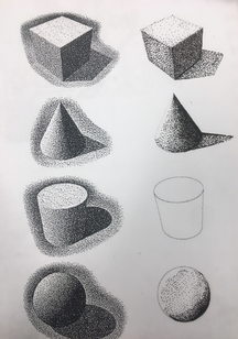
Stippling
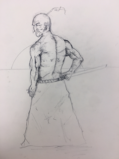
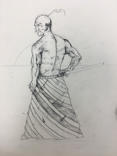
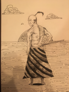
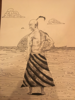
Final Pen & Ink project
Critique Questions:
1. I arranged the composition by putting the character in front and putting a sun behind him to make the scene more dramatic. The lack of clouds makes the atmosphere more lonely and desolate in conjuction with the open landscape.
2. The texture in the piece gives the character's muscles depth and structure. The patterns overlay the ground, his clothes, and the sun. The patterns on the ground gives the ground definition, while the patterns on his clothes make them more interesting. The flame pattern on the sun makes it seem very hot and aggressive while the simple patterns of the clouds are less chaotic and contrast the chaotic patterns of the sun.
3. Value is important for making the subject seem real, and create shadow. without it, it would make the character seem plain and flat.
4. The craftsmanship on the piece is not the greatest. the patterns are shaky and not all congruent. The right arm seems like its connected by a pin such as an action figure, and the skirt or cloth is flat and unconvincing. the values arent well blended and there are many anatomical problems.
5. The practice studies improved my use of the pen, but the patterns practice seemed redundant and very tedious. I also struggled trying to find places to put the patterns while not entirely compromising the piece.
6. The crosshatching is very important to make a successful pen and ink piece, but the style you choose to make the piece in impacts the choice of technique greatly. Understanding the techniques in class are important to successfully bring together a piece and make it look appealing.
7. Learning basic techniques is pivotal to grow as a young and growing artist, but the drawing itself and the basics of structure and the process is just as important, not to mention anatomy. of not just people, but animals, objects, bugs etc. understanding how things are held together and work make drawings better and more accurate.
8. I would use a reference, spend longer on the pencil sketch, make lines more deliberate, chose a different pose, and make sure the clothes are just as well composed as the human form, by illustrating the folds, and having the pattern follow the contours of the fabric.
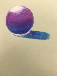
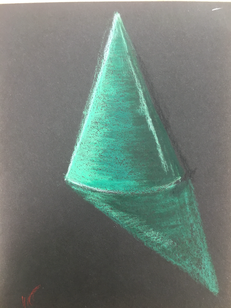
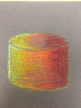
PrismaColor Shapes
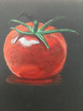
PrismaColor Tomato
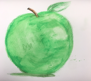
WaterColor pencil Apple
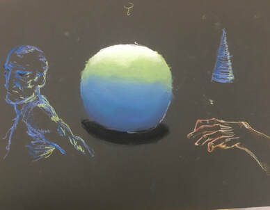
Practice with pastels
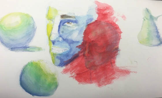
Practice with watercolors
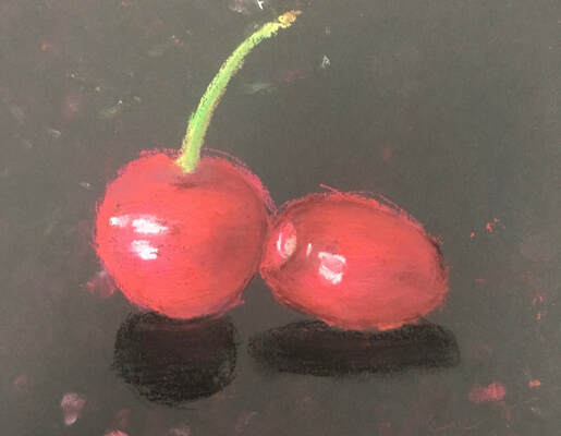
Patel cherries
Colored pencil final in progress
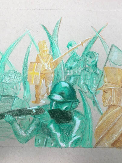
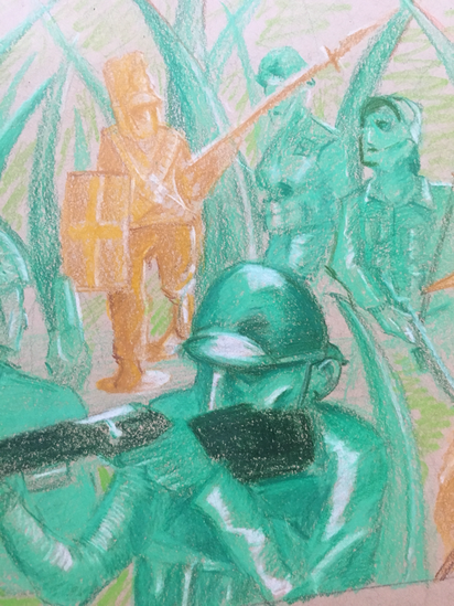
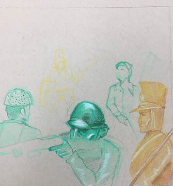
Critique Questions: 1. The composition is focused on the guy in the front with the rifle. The other figures are behind him in different colors intermingling with the grass. 2. I used value to create dimension by using darker colors where light wont hit to make the folds in the clothes and Bright colors to make the figures look shiny. It is important to make the figures have volume and have dimension.
3. By using exaggerated color I achieved making the figures look shiny and to highlight important features. 4. The project is alright technically but needs the figures and environment to be more fleshed out. 5. yes i was by making the figures in the back smaller and darker while doing the same with the grass. The picture is focused on the figure in front making the foreground. 6. The obstacles with pastels were that they aren't very accurate and they smear easily. The colored pencils don't erase, and they require lots of layers to make something look good.
3. By using exaggerated color I achieved making the figures look shiny and to highlight important features. 4. The project is alright technically but needs the figures and environment to be more fleshed out. 5. yes i was by making the figures in the back smaller and darker while doing the same with the grass. The picture is focused on the figure in front making the foreground. 6. The obstacles with pastels were that they aren't very accurate and they smear easily. The colored pencils don't erase, and they require lots of layers to make something look good.
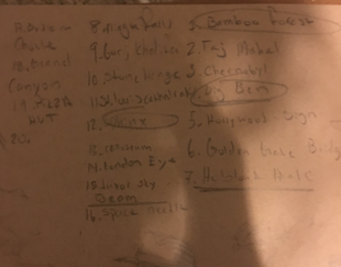
Ideas for print making
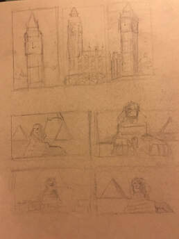
Print making sketches
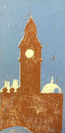
In progress photos of printing
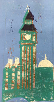
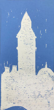
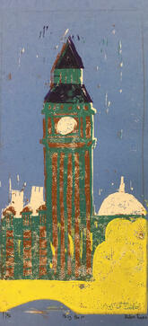
Best 3 final products
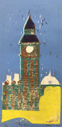
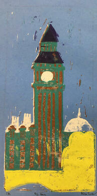
Critical Questions:
1. In terms of craftsmanship, i think i did relatively okay with this piece, and got a sufficient amount of ink on the paper (in most instances) but i did get some unwanted ink on the blue from the roller hitting elevated spots on the linoleum.
2.texture was interesting because big ben and structures surrounding it are made of bricks and stone. the perspective is far away, which makes it impossible to define the spaces between brick and stone. Those factors made it relatively simple to pull off the texture which was just laying down the ink in places. I think the brown works well with the warm blue and makes it look calm and meld with its surroundings. The yellow bushes and bridge in front of big ben creates contrast and gives a good foreground. Big ben itself has a purple roof (which was really difficult to place down in the right spot) that is the actual color of big ben's roof.
3. If I could redo the piece i would make the structure less complicated and actually lay down the colors properly. I would also cut down the empty bits of linoleum to make sure the roller doesnt catch them and make the sky dotted with traces of brown, white, etc.
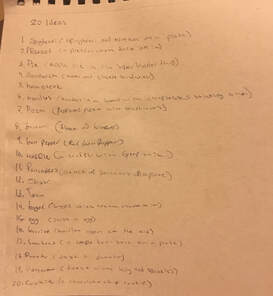
Ideas for clay project
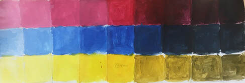
Value Chart
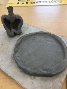
Clay Food in progress
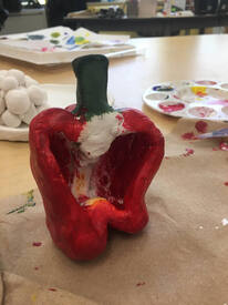
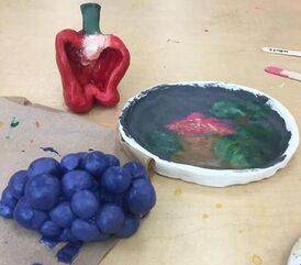
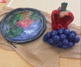
Clay Foods Final
